What Makes a Product Sellable (And How Patterns Help)
Let's talk about the thing nobody wants to admit: making a great product isn't enough.
You can pour your heart into creating something beautiful, functional, and well-made - and it still might not sell. Because in a world where people have endless options, being "good" isn't what makes them choose you.
What makes a product sellable isn't just about quality (though that obviously matters). It's about the first impression, the emotional pull, the visual identity that makes someone stop scrolling and think, I need that.
So let's break down what actually makes products sell - and where patterns fit into that equation.
You have 3 seconds.
That's it. Three seconds for someone scrolling past your product online, walking past it on a shelf, or stopping mid-scroll on Instagram to decide: Do I care about this?
Research shows that shoppers make snap judgements about products in 3-7 seconds. And online? You've got even less time. Some studies suggest you have as little as 50 milliseconds to catch attention before someone scrolls past.
With so many options out there - so many candles, tote bags, skincare products, notebooks competing for attention - it's tough to stand out.
But here's the good news: once you understand what makes people stop and pay attention, you can design for it.
People buy with their eyes first. Before they read your product description, before they check the price, before they even know what it does - they see it. And in those first few seconds, their brain is making snap judgements:
Does this look professional?
Does this feel like something I'd want to own?
Does this match my aesthetic?
Does this stand out from everything else?
Good design isn't just about looking pretty. It's about signalling value, quality, and intention in a single glance. It builds trust before they've even touched the product.
Part 1: What makes a product sellable?
Visual Appeal & First Impressions
Here's the thing about products that sell: they make people feel something.
If you're buying a candle, you're not just buying wax and a wick. You're buying the feeling of coming home after a long day and lighting something that makes your space feel cosy. You're buying a moment of calm, a sensory experience, a vibe.
Functionally, most products in a category are pretty similar. A candle from Brand A probably burns about as well as a candle from Brand B. A tote bag is a tote bag.
So why do people choose one over the other?
Emotional connection.
The products that sell aren't just solving a functional problem - they're solving an emotional one. They make the customer feel seen, understood, or aspirational. They communicate values that align with the buyer's identity.
And here's where design plays a huge role: aesthetics are a language. The way your product looks communicates what it stands for.
A minimalist, neutral design says, I value simplicity and calm.
A bold, vibrant pattern says, I'm unapologetic and playful.
A nature-inspired, earthy design says, I care about the planet and natural beauty.
When your product's design aligns with your customer's values and aesthetic, it creates a connection that goes deeper than "I need a candle." It becomes, I need THIS candle, because it feels like me.
Emotional Connection
Let's be real: there's a difference between something that looks homemade and something that looks handmade with intention.
Both can be made by hand. Both can be high quality. But one signals care, professionalism, and attention to detail - and the other… doesn't.
Here's the brutal truth: customers judge quality based on what they see, not just what the product actually is.
If your packaging looks thrown together, if your product design feels like an afterthought - people assume the product itself is lower quality, even if it's not.
On the flip side, if your product looks polished, cohesive, and thoughtfully designed? People assume it's premium. They're willing to pay more. They trust that the product inside matches the care you put into the outside.
Details like a well-designed label, cohesive packaging, and consistent patterns across your product line signal professionalism. And professionalism builds trust. And trust makes people buy.
Professionalism & Perceived Quality
Let's be honest: your product probably isn't functionally unique.
If you're selling candles, there are thousands of other candle makers out there. If you're selling skincare, tote bags, stationery, home goods - same deal. The market is saturated.
So what makes someone choose your product over all the others?
Your visual identity.
This is where distinctive design becomes your competitive advantage. When your products have a recognisable look - a signature pattern, a consistent colour palette, a style that's unmistakably yours - you stand out.
That's the power of a strong visual identity. It makes you memorable. It makes you different. It gives people a reason to choose you when everything else is functionally the same.
Standing Out in a Crowded Market
Consistency Across Your Line - Two Approaches
Here's where it gets interesting: consistency doesn't look the same for every brand.
This is the traditional approach. Your products share a consistent aesthetic - same colour palette, similar design style, patterns that work together visually.
This works really well for product-based businesses where customers want things that coordinate. Think homewares collections, stationery sets, or product lines designed to live together on a shelf.
Visual Cohesion:
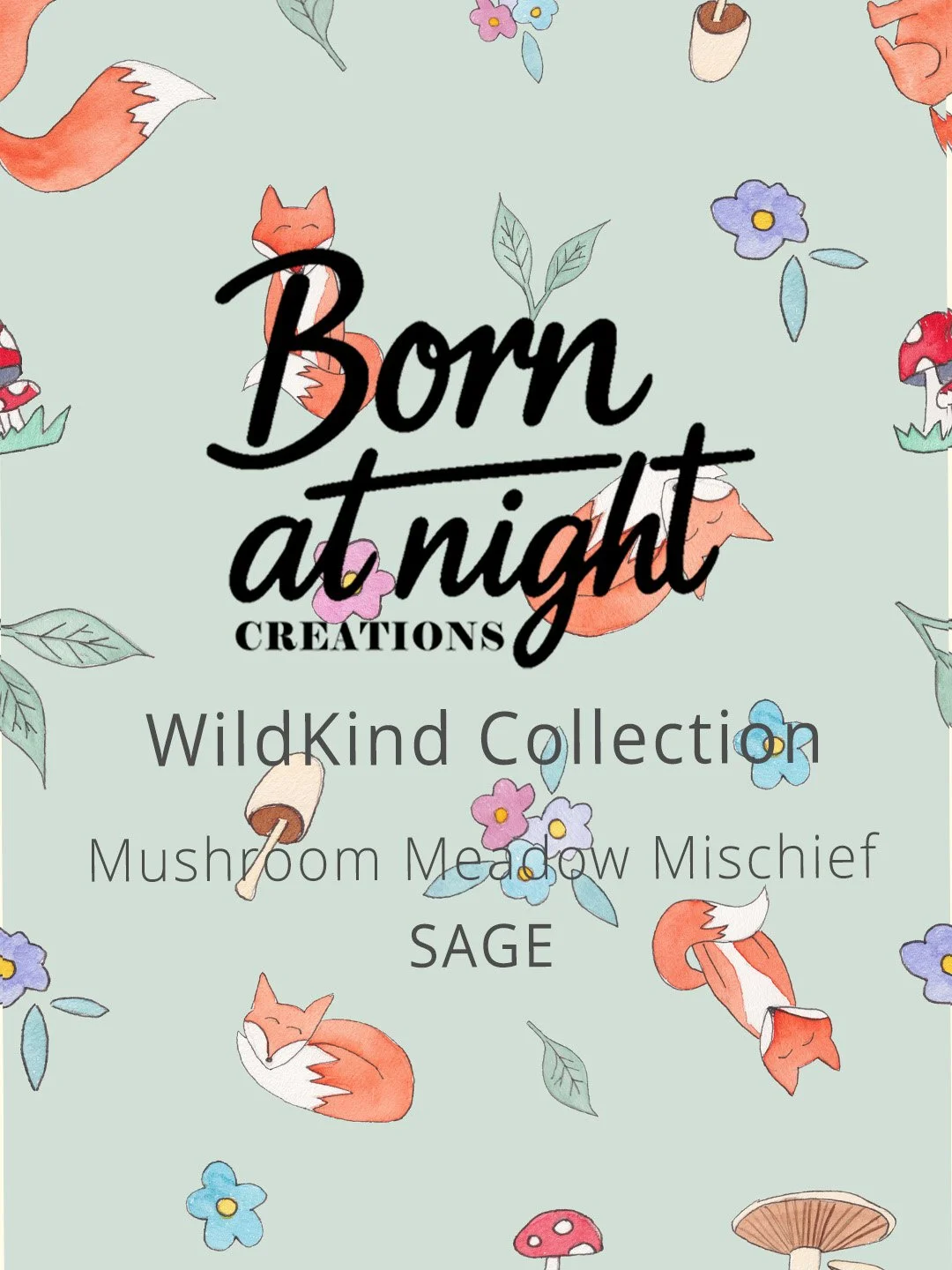
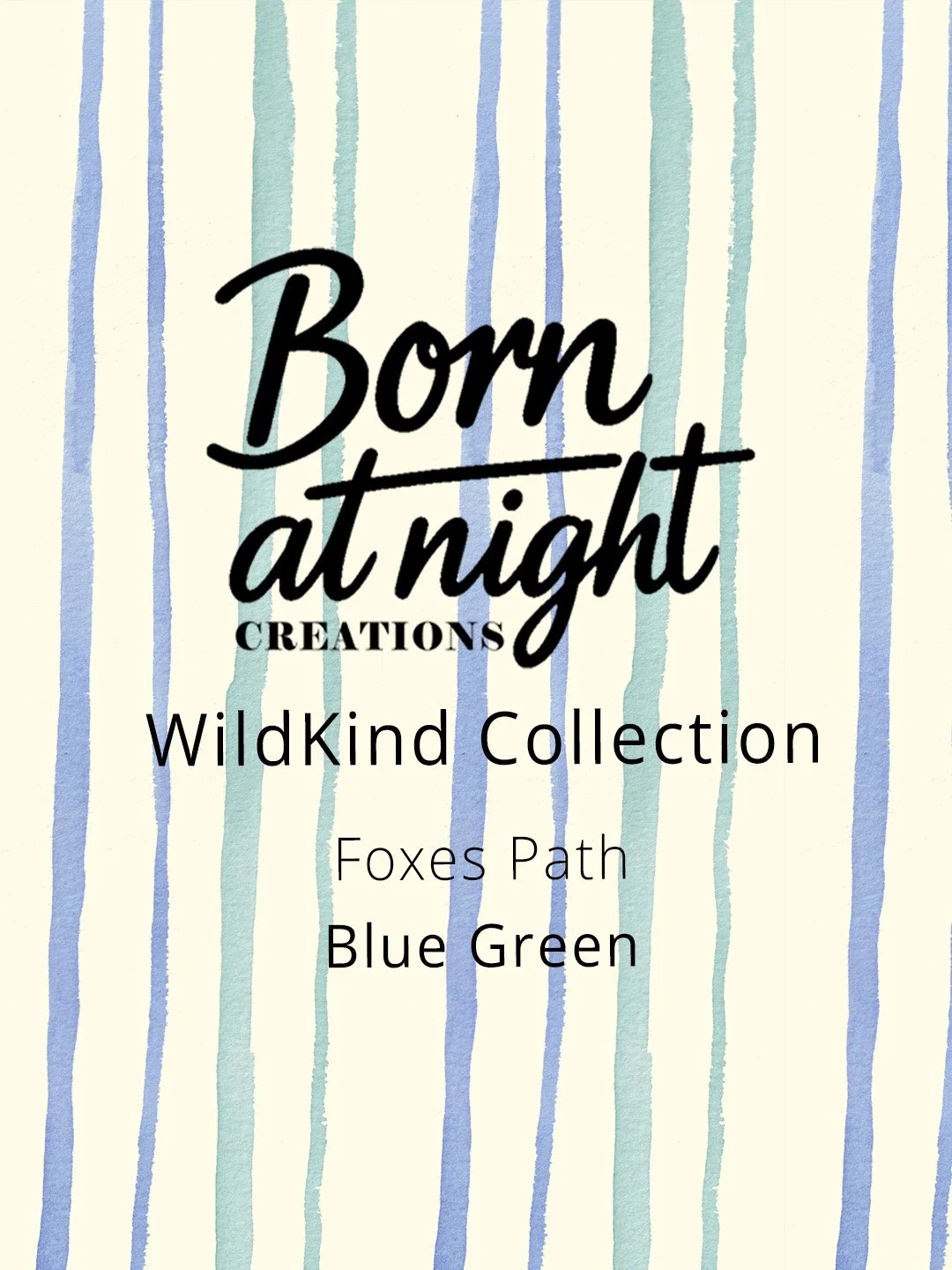
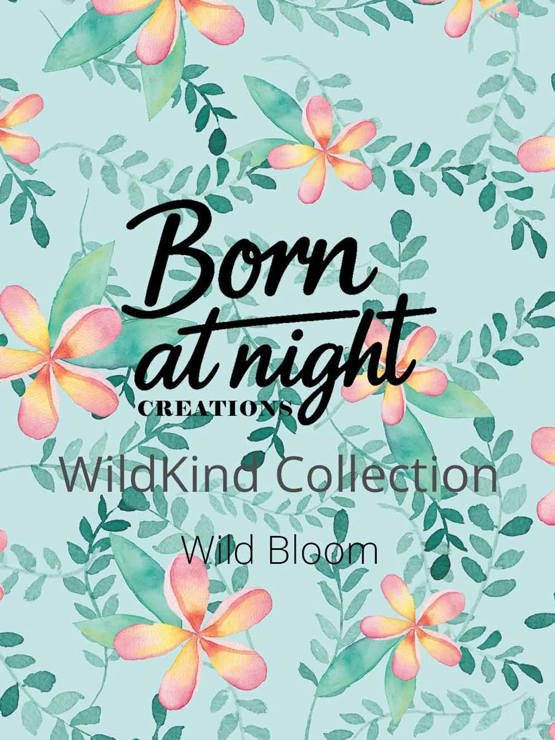
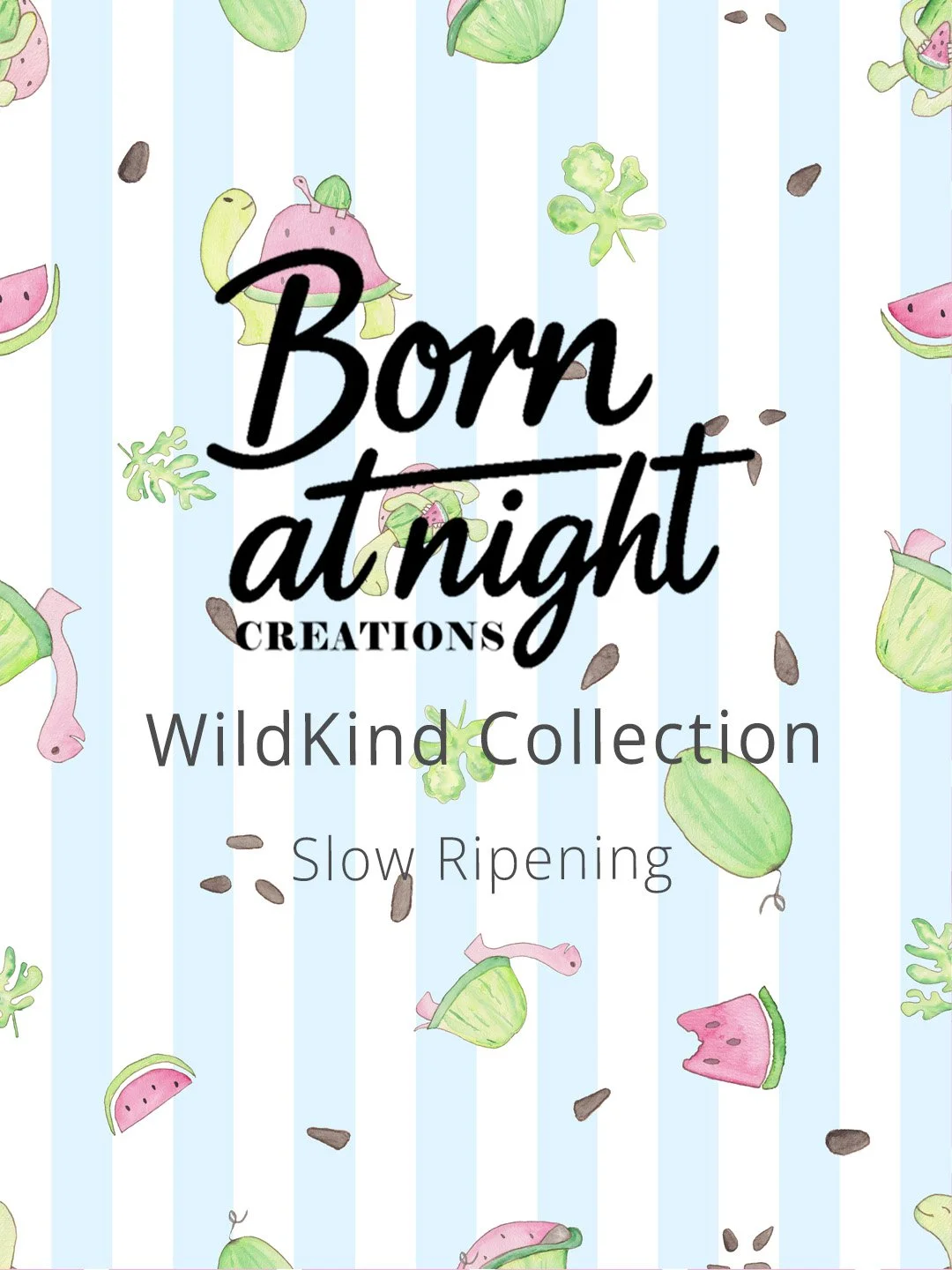
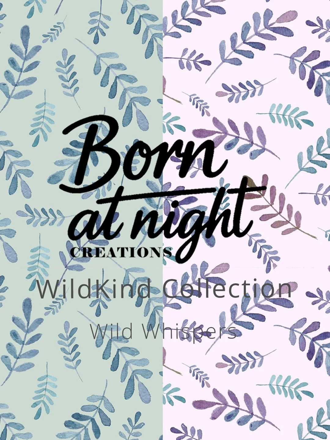
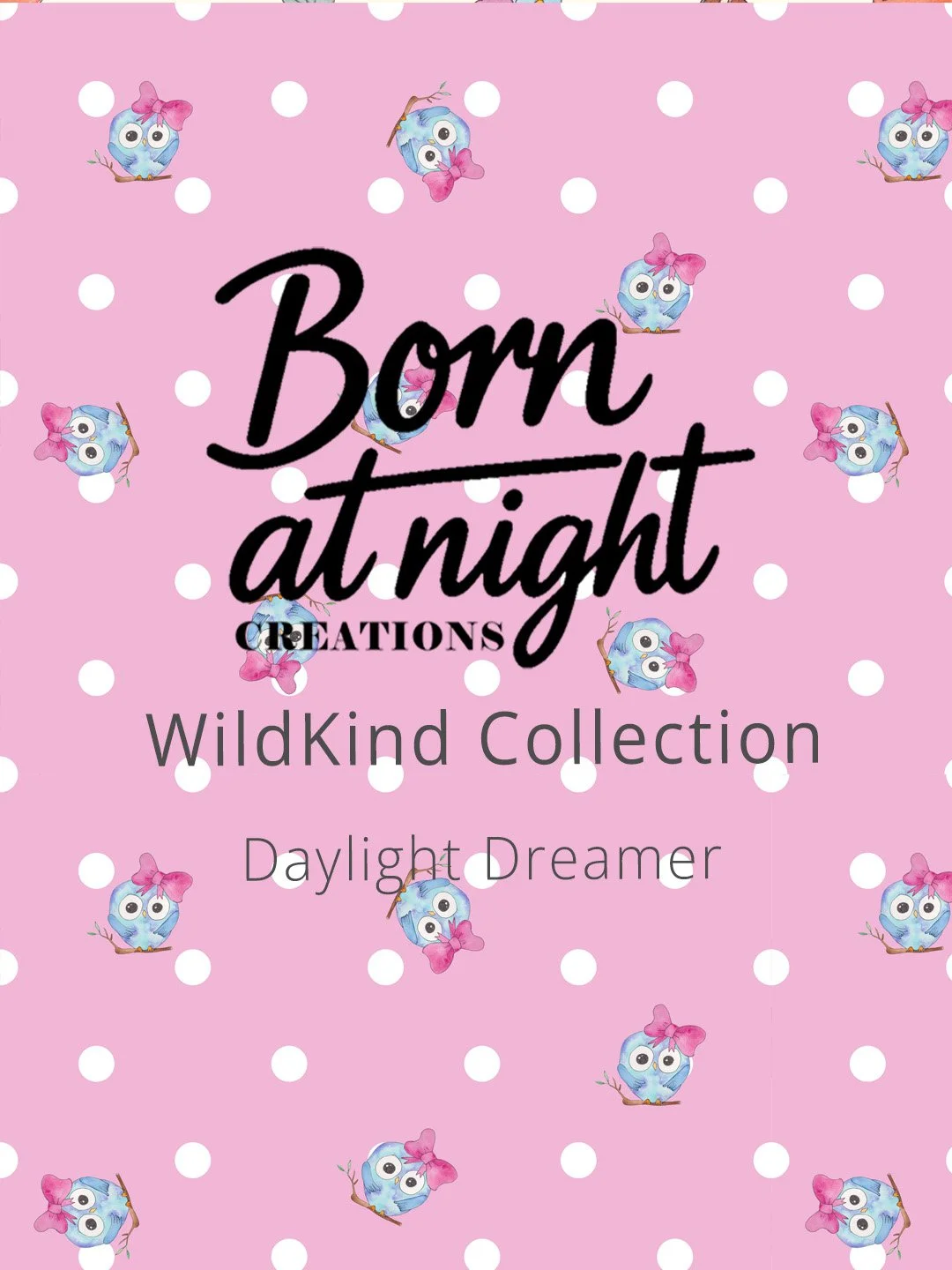
This is the approach I took with the WildKind collection (for the most part) - and it breaks the traditional "rules."
Instead of everything looking visually similar, the products are connected by story and meaning. Each pattern has a different aesthetic, but they're all part of the same narrative journey.
This approach works when your brand is built on storytelling and values. It attracts customers who connect with the deeper meaning behind the work, not just the surface aesthetics.
Thematic Cohesion:
Your brand identity (story-driven or aesthetic-driven?)
Your customer base (buying for meaning or for matching?)
Your product type (some benefit more from visual cohesion, others from thematic)
The key is intentionality. Your products need to feel connected - whether that's through visuals or through story. Random patterns with no relationship? That's when it falls flat.
Both approaches work. It depends on:
Part 2: How Patterns make products more sellable
Patterns aren't just decoration. When used strategically, they're one of the most powerful tools you have for making your products more sellable.
Remember those 3 seconds you have to grab attention?
A well-chosen pattern is one of the fastest ways to make someone stop and look.
Think about it: a plain white tote bag vs a tote bag with a beautiful, eye-catching pattern. Which one are you more likely to notice? Which one feels more interesting, more special, more worth the price?
The right pattern adds visual interest without overwhelming the product. It creates that crucial first impression that stops the scroll or catches the eye on a shelf.
Patterns Elevate Visual Appeal
Patterns Create Emotional Connection
A well-chosen pattern doesn't just look good - it tells a story.
Patterns communicate vibe, personality, and values in a way that's immediate and emotional:
A botanical pattern speaks to someone who loves nature
A bold geometric pattern appeals to someone who's modern and confident
A whimsical, hand-drawn pattern connects with someone who values playfulness and creativity
A transformation-themed pattern resonates with someone on a personal growth journey
When a customer sees a pattern that reflects their personality, their values, or their aspirations - that's when it shifts from "I like this" to "I need this in my life."
And that emotional pull? That's what makes people buy.
A thoughtfully chosen, well-designed pattern signals professionalism. It shows attention to detail. It proves that you didn't just slap a design on a product and call it done.
When someone sees cohesive pattern use across your packaging and products - they think, This brand has their shit together.
And that perception of professionalism directly translates to trust. Customers assume that if you care this much about the design, you probably care just as much about the quality of the product itself.
Patterns Signal Professionalism
In a crowded market, patterns are your secret weapon for differentiation.
In a sea of plain products with generic labels, one with a distinctive, beautiful pattern immediately stands out. It catches the eye. It feels different.
And when that pattern becomes part of your signature look - when people start recognising your products by the pattern alone - you've created something powerful
Patterns Help You Stand Out
Patterns Create Cohesion (Both Ways)
Patterns are the tool that makes both visual and thematic cohesion work.
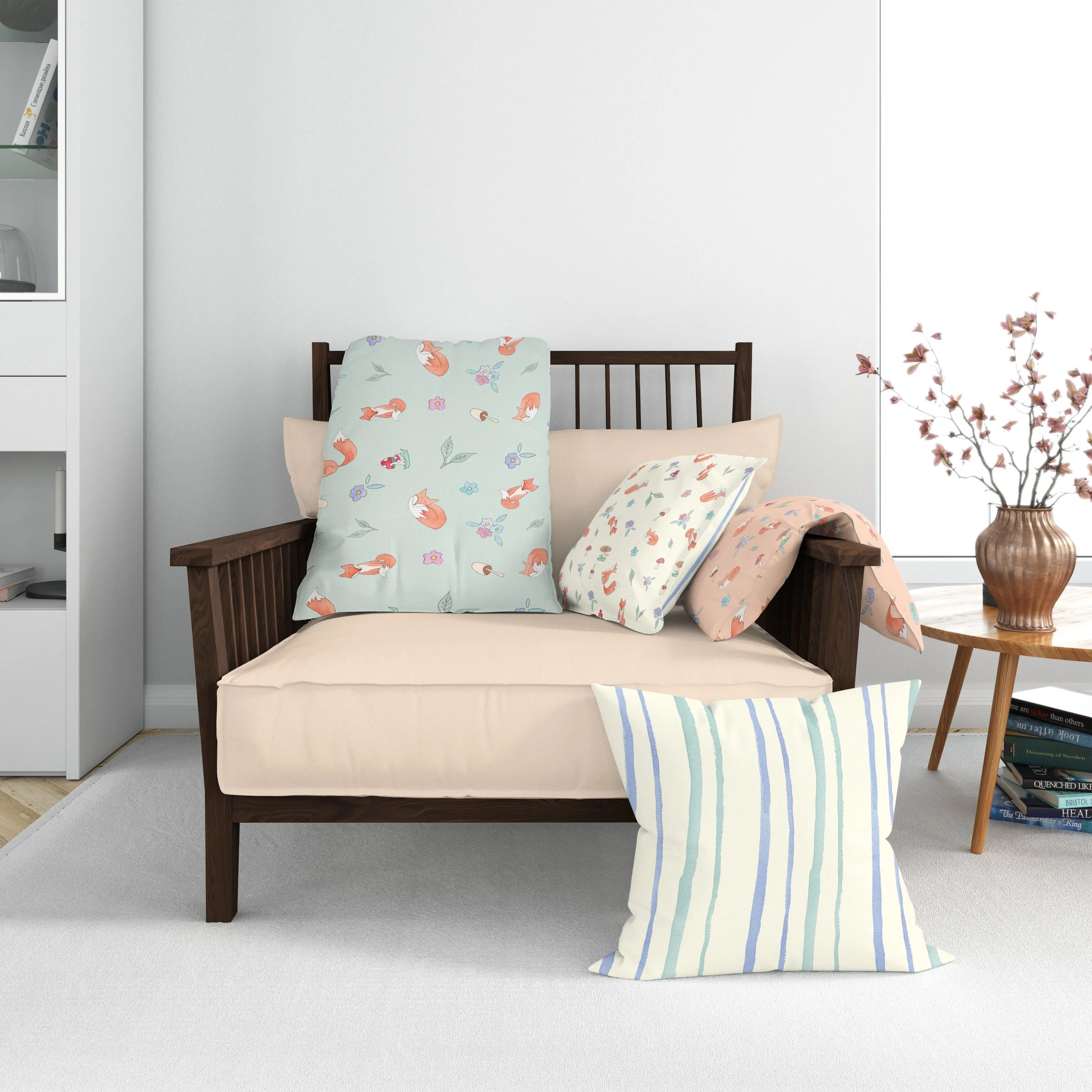
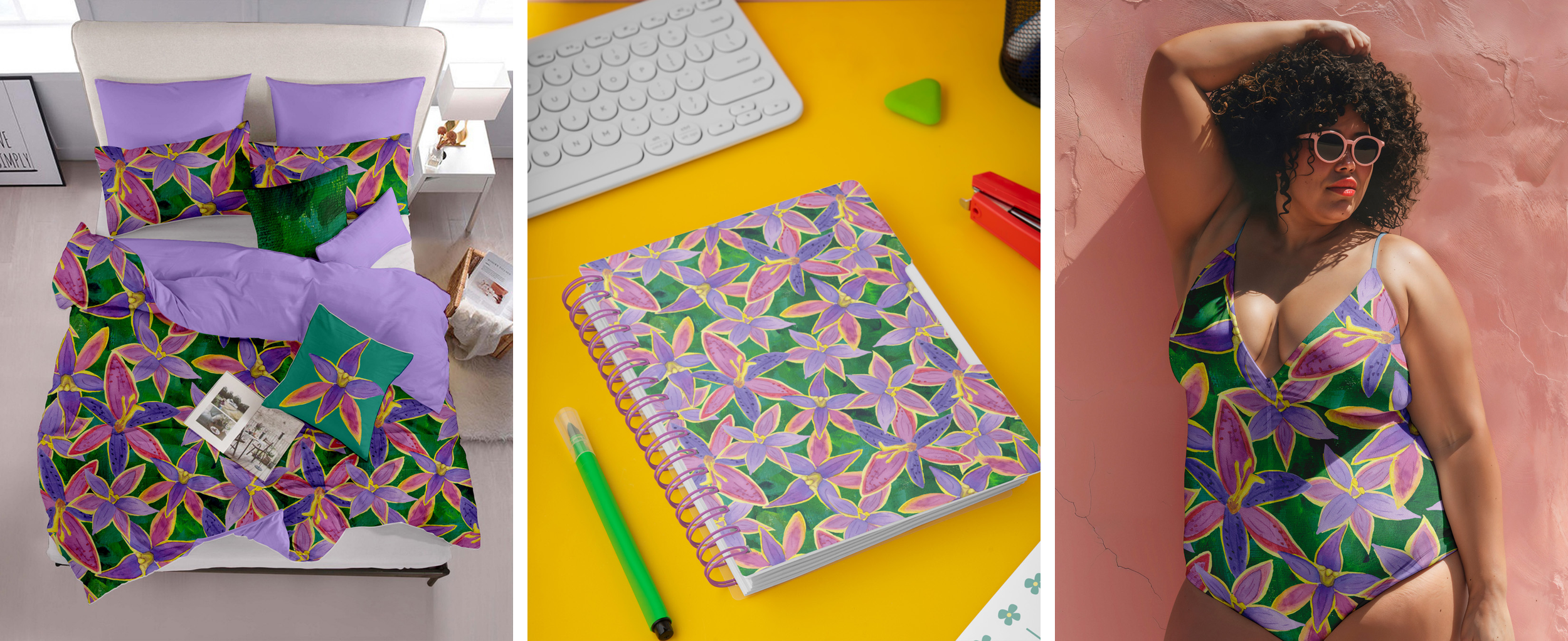
For Visual Cohesion: One pattern (or a family of coordinating patterns) across multiple products creates instant brand recognition. When someone sees the same pattern on your tote bag, notebook, and candle packaging - they immediately know it's all from the same brand.
For Thematic Cohesion: Different patterns that share a story or meaning create a different kind of connection. Each product feels unique, but customers understand they're part of a bigger narrative.
Either way, patterns are what tie it all together.
Part 3: What to look for in patterns to help sell-ability
Not all patterns are created equal. Here's what to look for:
Patterns that help sell-ability have:
Versatility - Works across multiple product types and applications
Emotional resonance - Makes you (and your customers) feel something
Scalability - Looks good at different sizes
Alignment with your brand - Tells your brand's story
Timeless appeal - Won't look dated in 6 months (unless you're intentionally trend-chasing)
Intentionality - Every choice feels purposeful
Patterns to avoid:
Too trendy (dated quickly unless that's your strategy)
Too generic (everyone has it, you don't stand out)
Doesn't match your brand (confuses customers)
Only works in one application (limits your growth)
No emotional pull (just "fine" isn't enough)
Feels random or unintentional
Part 4: Using Patterns Strategically
If you're building visual cohesion:
Too trendy (dated quickly unless that's your strategy)
Too generic (everyone has it, you don't stand out)
Doesn't match your brand (confuses customers)
Only works in one application (limits your growth)
No emotional pull (just "fine" isn't enough)
Feels random or unintentional
If you're building thematic cohesion:
Choose patterns that tell parts of your brand story
Make the story clear in your marketing
Embrace visual distinction (that's the point!)
Focus on emotional resonance over visual matching
Starting out?
Start with one pattern. Test it across multiple products. Pay attention to customer feedback.
Don't underestimate the power of good design when it comes to pricing. A product with a beautiful, intentional pattern can command a higher price than the exact same product with no design or a generic pattern.
As you grow, decide: Am I building visual cohesion or thematic cohesion? Or maybe a mix of both? Both paths are valid.
Making sellable products isn't about luck. It's about strategy.
It's about understanding that people buy with their eyes first. That emotional connection matters more than function. That professionalism and cohesion build trust. That standing out in a crowded market requires intentional design choices.
And patterns? They're one of the most powerful tools you have to make all of that happen.
The right pattern elevates visual appeal, creates emotional resonance, signals professionalism, helps you stand out, and ties your product line together.
The Pattern Library was created with exactly this in mind. Every pattern is hand-designed (not AI-generated). Every choice is intentional. Every design is meant to help your products not just look good, but actually sell.
Whether you're building a visually cohesive collection or a thematically connected line, there are patterns here designed to help you do exactly that.
The point is: patterns aren't just decoration. They're business tools. They're what make your products stop the scroll, catch the eye, create connection, and ultimately - sell.
So if you're ready to elevate your products with patterns designed to actually work (not just look pretty), explore the library. I think you'll find something that fits exactly what you're building.
Because great products deserve great design. And great design? That's what makes products sellable.
Bringing it all together
Ready to find your perfect pattern? Explore the Pattern Library →

What makes a product sellable to you? What catches your eye and makes you stop scrolling? I'd love to hear your thoughts - send me a message and let me know.